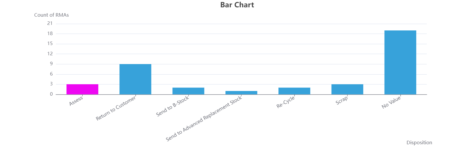
A Bar Chart is a graph that uses rectangular bars to represent data. It’s great for comparing values across different categories. each bar represents a category or group, with its height indicating the value of that category. The horizontal axis (X-axis) displays the categories being compared. The vertical axis (Y-axis) represents the statistical values associated with each category, allowing for easy comparison between them. This value could represent various metrics, such as sum, average, or count of objects within each category.
Creating a Bar Chart
To create a Bar Chart, follow these steps:
Select Bar as the Chart Type.
The Main Chart Field lets you select the primary field for your bar chart. Each value in this field becomes a bar, representing a category.
Note:
When the Main Chart Field is a datetime field, you can set the time interval for displaying it on the axis. The available interval options are Year, Month, Day and Year and Month, allowing you to customize the granularity of data shown on the chart.
The Extra Chart Field option lets you add a secondary comparison within each main category. For example, if the main chart field is Disposition, you can use the Extra Chart Field to break down each disposition by Province, adding an extra layer of detail. This allows you to compare groups within each main category.
By default, the system assigns colors to the chart. However, if you want to customize colors for specific values, use the Chart Color Mapping option. If there’s an Extra Chart Field, color mapping will apply to its values; otherwise, it applies to the Main Field. Click the + icon to add a new color mapping, then:
Select the value you want to color.
Use the color picker to choose the color.
Aggregate Type: Choose the type of statistic that will be used to create the bar chart. The available options are:
Count displays the number of occurrences.
Sum shows the total value.
Average displays the average value of the data.
When "Sum" or "Average" is selected, an additional dropdown appears, allowing you to choose the specific field for these calculations.
Date Range: To narrow down data to a specific period, select a date range. You can either set a custom interval or pick a predefined interval, such as the current year, month, week, or day.
Date Field: After selecting a date range, choose the relevant date field for which you want to apply the time interval. The Date Field dropdown will display all available date and date-time fields for you to choose from.
Few Examples
Bar Chart with Main Chart Field Only
In this chart, RMAs are grouped by Disposition, with each disposition type forming a separate bar. The height of each bar represents the number of RMAs within that specific disposition. To emphasize RMAs marked as "Assess," a custom color has been applied to the "Assess" bar, making it easily distinguishable from others.

Agent Portal: Bar Chart
The screenshot below displays the configuration for the bar chart described above.
.png)
Admin Portal:Chart Settings
Bar chart with Extra Chart Field
Tip
💡 :You can click on the options displayed in the legend at the bottom to select or deselect specific provinces. This will automatically refresh the chart to reflect your selection, allowing you to focus on specific data segments within the categories.
.png)
Agent Portal: Bar Chart
The screenshot below displays the configuration for the bar chart described above.
.png)
Admin Portal: Chart settings