A Line Chart is a graph that uses a line to connect data points in a sequence, typically over time. It’s ideal for showing trends, changes, or patterns across a continuous period. The line in the line chart makes it easy to see increases, decreases, or trends over time.
The horizontal axis(X- Axis)usually shows time intervals like days, months, or years, or sequential categories, such as product stages or steps. The vertical axis represents the measured metrices like "Total Amount," "Number of Claims," or "Average Repair time."
Creating a Line Chart
To create a Line Chart, follow these steps:
Select Line as the Chart Type.
The Main Chart Field lets you choose the primary field for your line chart, which forms the values along the horizontal axis. For line charts, fields like dates or sequential categories work well here, as they show trends over time or progression.
Note:
When the Main Chart Field is a datetime field, you can set the time interval for displaying it on the axis. The available interval options are Year, Month, Day, and Year and Month, allowing you to customize the granularity of the data shown on the chart.
The Extra Chart Field allows you to add additional variables, creating multi-line comparisons within the same chart. This feature is useful for comparing different groups or segments on a single chart.
Aggregate Type: Choose the type of statistic that will be used to create the line chart. The available options are:
Count displays the number of occurrences.
Sum shows the total value.
Average displays the average value of the data.
When "Sum" or "Average" is selected, an additional dropdown appears, allowing you to choose the specific field for these calculations.
Date Range: To narrow down data to a specific period, select a date range. You can either set a custom interval or pick a predefined interval, such as the current year, month, week, or day.
Date Field: After selecting a date range, choose the relevant date field for which you want to apply the time interval.
Note:
Chart Color Mapping feature is not available for line charts.
.png)
Admin Portal: Line Chart Configuration
Few Examples
Line Chart with Main Chart Field Only
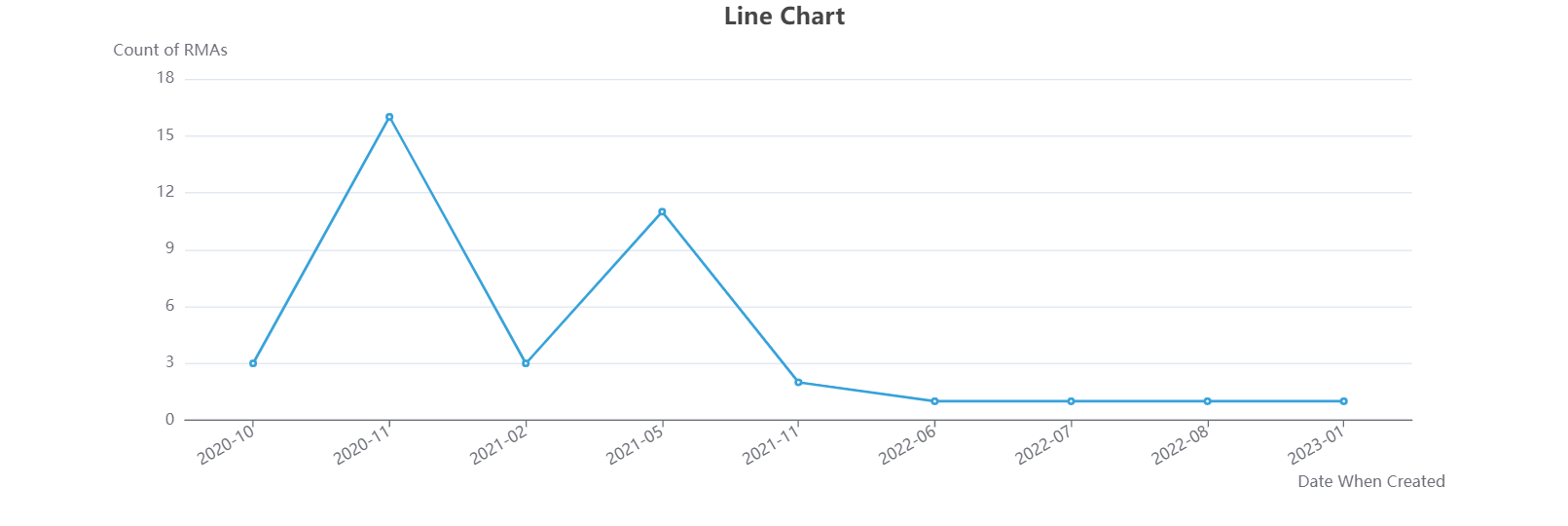
In the chart below, the main field is "Date When Created", which appears on the X-axis, while the Y-axis displays the count of RMAs. This chart allows us to see how new RMAs are filed over time. Each point on the line represents the count of RMAs in a specific month, with the line connecting these points to show trends over time. For instance, the data shows that the highest number of RMAs were created in November 2020.

Agent Portal: Line Chart
Line Chart with Extra chart field
The chart below tracks the trend of RMA creation and also compares RMA counts across provinces or states over time. Each color in the legend represents a province, allowing you to select or deselect them to update the chart view dynamically. Adding Province/State as an Extra Chart Field in the line chart configuration enables this regional comparison.
.png)
Agent Portal: Line Chart